K KPdaKINGPIN Fresh Oct 2, 2008 #1 Sep 6, 2008 5 0 0 45 Oct 2, 2008 #1 K KPdaKINGPIN Oct 2, 2008 Been workin on some different techniques...let me know what ya'll think...good/bad, just lookin to get better KP.
Been workin on some different techniques...let me know what ya'll think...good/bad, just lookin to get better KP.
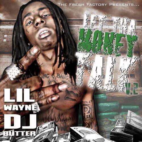
M MDebruce Noble Oct 2, 2008 #2 May 20, 2008 1,387 0 0 39 Oct 2, 2008 #2 M MDebruce Oct 2, 2008 why wayne look so blurry
prodigy91 @jordvnxsf Oct 2, 2008 #3 Mar 20, 2008 8,955 514 0 34 SF Oct 2, 2008 #3 prodigy91 Oct 2, 2008 not feelin the text on any of these step your text game up
CHAPO GUZMAN Sicc OG Oct 2, 2008 #4 Jan 5, 2006 13,536 3,427 0 38 Oct 2, 2008 #4 CHAPO GUZMAN Oct 2, 2008 yeah weezy looks really blurry in that pic.
FANATIKAL Sicc OG Oct 2, 2008 #5 Jan 10, 2003 1,870 2 0 Oct 2, 2008 #5 FANATIKAL Oct 2, 2008 Im not feelin the smoke effect you went for on all three of them...other than that and the text being boring, not too bad..
Im not feelin the smoke effect you went for on all three of them...other than that and the text being boring, not too bad..
L lil_wattage Sicc OG Oct 2, 2008 #6 Jan 6, 2003 1,092 0 0 www.midwestinvasion.com Oct 2, 2008 #6 L lil_wattage Oct 2, 2008 they have potential. just work on the text and blending a lil bit and they could be good
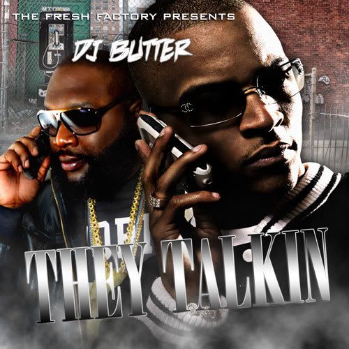
prodigy91 @jordvnxsf Oct 2, 2008 #7 Mar 20, 2008 8,955 514 0 34 SF Oct 2, 2008 #7 prodigy91 Oct 2, 2008 the render clouds are way to obvious on the second one
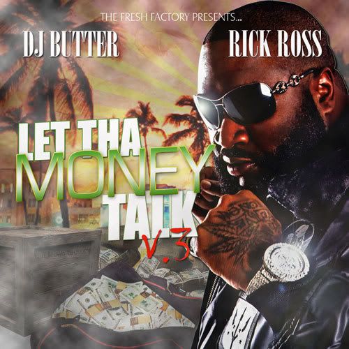
D Des504 destructCo. Oct 2, 2008 #8 Oct 13, 2002 1,179 17 0 40 louisiana etsy.com Oct 2, 2008 #8 D Des504 Oct 2, 2008 I really dig the colors on the 3rd. Take some of that smoke out, and give the title font a thicker outline. er, it would appeal to me more if done like that. they're still really nice...def. got some potential.
I really dig the colors on the 3rd. Take some of that smoke out, and give the title font a thicker outline. er, it would appeal to me more if done like that. they're still really nice...def. got some potential.
K KPdaKINGPIN Fresh Oct 2, 2008 #9 Sep 6, 2008 5 0 0 45 Oct 2, 2008 #9 K KPdaKINGPIN Oct 2, 2008 Thanks for tha Feedback folks...yeah tha text game is def. in need of work...anybody got any tutorial suggestions on tha text?
Thanks for tha Feedback folks...yeah tha text game is def. in need of work...anybody got any tutorial suggestions on tha text?
Hihlosis Sicc OG Oct 2, 2008 #10 Aug 5, 2002 2,012 7 0 44 Oct 2, 2008 #10 Hihlosis Oct 2, 2008 looks good, a little text work and they'd go.
numba2stunna Sicc OG Oct 2, 2008 #11 Jun 4, 2004 3,183 7 0 Oct 2, 2008 #11 numba2stunna Oct 2, 2008 First one is terrible.. mostly the Pic is just bad... the other two are cool, the second one is best of the three. Second is clean.... keep it up...
First one is terrible.. mostly the Pic is just bad... the other two are cool, the second one is best of the three. Second is clean.... keep it up...
INCHEZ Sicc OG Oct 6, 2008 #12 Jan 2, 2003 2,175 0 0 43 Oct 6, 2008 #12 INCHEZ Oct 6, 2008 Not bad homie.. Keep at it...