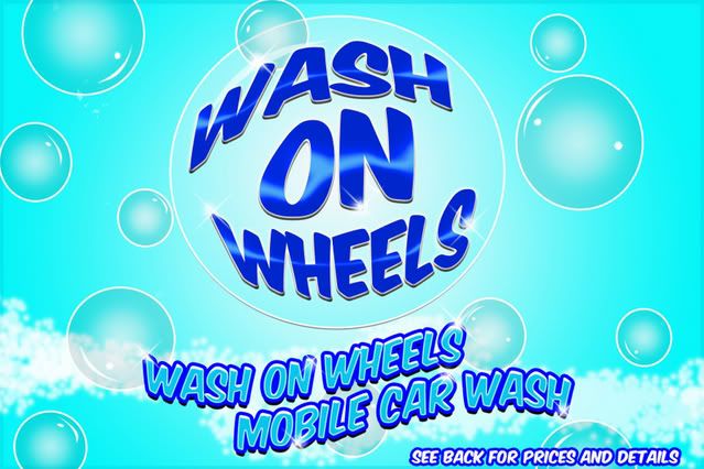
WASH ON WHEELS FLYER
- Thread starter )-HANGMAN-(
- Start date
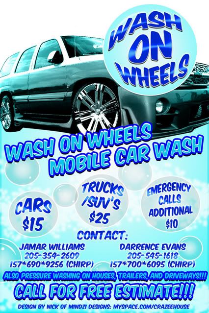
^ that & the only thing i didnt like was the car being
the same color as the layout,
id have lowered the opacity on the color overlay
to make the car stand out a tad.....
otherwise: simple and to the point..just like it should be....
alot of designers fail to realize that it doesnt
have to be busy or extravagant to the job right......
the same color as the layout,
id have lowered the opacity on the color overlay
to make the car stand out a tad.....
otherwise: simple and to the point..just like it should be....
alot of designers fail to realize that it doesnt
have to be busy or extravagant to the job right......
word appreciate that. and yeah i might drop a shadow and lower the opacity a tad. i also gotta add some small logos in the bubbles on the front there cause thats what the client wants. hes the guy who owns a record label and this is a younger cat who he is helping out start this business so he wants some other things promoted on this flyer too.
and yeah id like to do a flyer with lots of things going on but sometimes that stuff looks too crammed up. i like the spaced out smoothed out nice flow looks to flyers. just nice catchy colors.
and yeah id like to do a flyer with lots of things going on but sometimes that stuff looks too crammed up. i like the spaced out smoothed out nice flow looks to flyers. just nice catchy colors.
yeah i think the truck throws it off for the back kinda breaks up the gradient real hard. but thats what they wanted was some kind of vehicle with big rims. but they dig it alot thats what matters. of course they did just want a pic of a white business van with a wash on wheels logo and thats it. but that shit looked too plain.