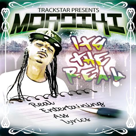
Trackstar Presents: Mordiki - Its The R.E.A.L. (Real Entertaining Ass Lyrics)
- Thread starter GrafsiccDesigns
- Start date

well then its a good thing its not for you and you didnt pay for it huh?
no one asked you anyways if it was done by someone else you probably wouldnt even comment but since its me you felt the need to say some negative shit.....
maybe if you were a talented graphic designer id take it as constructive criticism but i still aint seen you do anything better than me so i dont really care about your opinion.....
all in all its a $100 mixtape layout....you cant get better work at that price....now if i charged homie 400 or something i definitely would of put more work into it but you get what you pay for....
Hahahaha you sound hella fucking but hurt, post up the topic where I hurt your feelings, because it seem to have slipped my mind. Meanwhile, I'm bored so let me break down your post.
Yup, wouldn't pay for that garbage.
You posted it on this board for feedback, no? If not, then go ahead and explain to me why you posted it here. Do you think everyone was waiting for you to finally post up the final complete version of this masterpiece? And why would you feel "I need to say some negative shit" about you? Again, post up the topic where I hurt your feelings.
I haven't posted work for about a year now so you have no idea what my work looks like. And I can guarantee my work looks better then this crap.
That's kinda fucked up tho, I mean you getting your money but I would've charged him less money for less work instead of less quality designs.
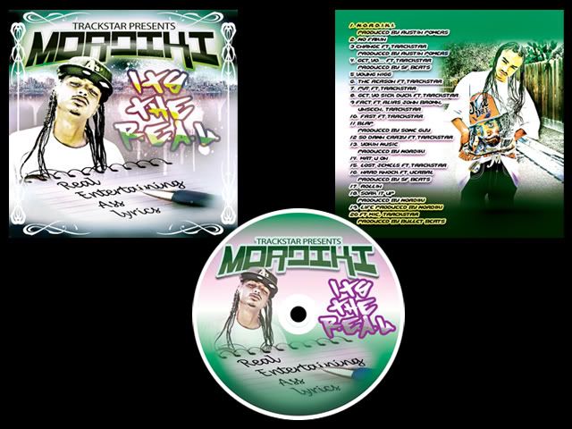
All in all this cover is garbage. Looks like you use some cheap ass knock off of Photoshop to make it. Looks super low quality like you ruined the pictures he took. A random color scheme, purple, green, yellow, blue? Were you basing it off of a bag of skittles or what? Ha. Also bad font and bad effects and coloring on that too. Don't get me wrong I've barely seen your work, that A-Bomb or whatever it was was cool but this one ain't.
well then its a good thing its not for you and you didnt pay for it huh?
no one asked you anyways if it was done by someone else you probably wouldnt even comment but since its me you felt the need to say some negative shit.....
maybe if you were a talented graphic designer id take it as constructive criticism but i still aint seen you do anything better than me so i dont really care about your opinion.....
all in all its a $100 mixtape layout....you cant get better work at that price....now if i charged homie 400 or something i definitely would of put more work into it but you get what you pay for....
It's decent, how long you been doing graphic design? The color scheme is all over the place, pick 3 colors and use 'em, you can use different shades of those 3 cause it will give you more to work with. Keep the same colors on everything. Don't use 6 colors on the front and then use only 2 of em on the traycard, everything has to flow together. Learn a few new effects for your text, cause the stroke on every bit of text ain't workin'.
I'm not feelin' the 'tribal' brushes you used to make the border on the front, or the way you brushed in the black corners, they don't even go all the way to the edge. All in all, not that great man, keep working at it.
maybe if you were a talented graphic designer id take it as constructive criticism but i still aint seen you do anything better than me so i dont really care about your opinion...
why do u have to be a talented graphic designer to give constructive criticism?? since according to u the "un-talented" graphic designer just told you that it pretty much sux, imagine what the "talented" one would say since his standards are probably higher......
@E. Man....its not just cuz of this simple post...dude has said sideways shit to me before along with this j cat above that just posted.....people like this tend to post negative shit just to do so....i dont care for them myself but when they post up i dont make it a point to post at all in thier threads....i dont even bother looking at em.....they dont like me but still feel the need to clicc on my threads and see what i post just to try to picc at it and find something bad to say.....ive seen them post props to shit that was way worse than this thats why i know they be on some bullshit.....
if i aint feeling someone shit i just pass it on i dont gotta make a remark on it....if someones work is really good then ill feel the need to give them some props.....
the whole direction of the cover is what the client wanted and what they paid for...i see lots of work done by some of yall around here that is sub par but most say its what the client wanted so yall should know how that goes....
@prodigy....i find it funny that you liked the 1st version i did of this cover when this one is a lot better.....
matter fact a lot of folks gave good comments on that 1st version and it succed....but as long as the client likes what he gots then its a job done.....
@E. Man....its not just cuz of this simple post...dude has said sideways shit to me before along with this j cat above that just posted....
Haha @ not directly responding to me. Still don't know where "I came sideways" at you but whatever. If I comment I ain't feeling your work, it's true I ain't feelin it I don't know what's so hard to understand about that. If I give you "props" (which I don't, I tell people "good job" or "I like it" with some feedback with it), then that means I'm feelin it, still don't know whats so hard about that. It ain't a direct attack at you I'm expressing myself. And again lemme know, where I came sideways at you.
Judging from the work youve posted up it seems like your trying to still do that Photodoctors style from like 2002- as someone above said Made Pro look, they pretty much copy what PD does so thats along the same lines as what Im saying. The very bright look and the use of way different colors. ex:


This style just looks dated to me..
This style just looks dated to me..
im not a graphic designer and stuff but to me this looks hella non profesional and cheap
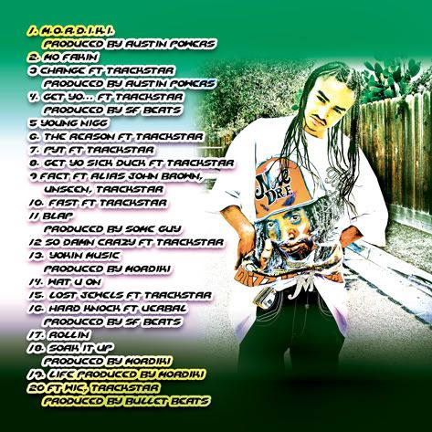
especialy the back part
the front part the text dont go with eachother
on a nother note i just got back from the raider game and sum dude was there selling trackstar c.d's
trackstar a rapper or like a producer dude?
especialy the back part
the front part the text dont go with eachother
on a nother note i just got back from the raider game and sum dude was there selling trackstar c.d's
trackstar a rapper or like a producer dude?


