These are just rough drafts so far. The one in my avatar is the closest to my liking. Let me know what you guy's think my feedback to the designer should include.
This is the first draft but the "Reynolds" family crest in the background was the wrong one:

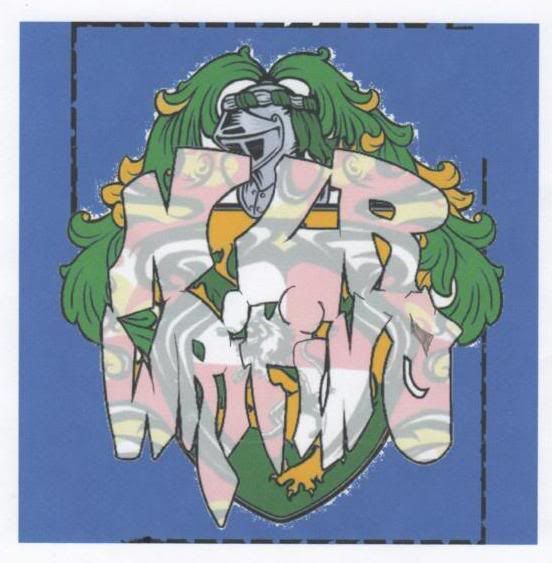
So on to this one with the correct crest but you cant read the word "Writing":

In this one I printed it and drew in some lines to help define the letters and scanned it. Problem is...you can't really see the crest and the red crest design in the lettering isn't even the same one....??:
What are your thoughts/opinions?
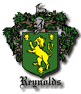
Heres the crest:
Heres the old logo:

This is the first draft but the "Reynolds" family crest in the background was the wrong one:
So on to this one with the correct crest but you cant read the word "Writing":
In this one I printed it and drew in some lines to help define the letters and scanned it. Problem is...you can't really see the crest and the red crest design in the lettering isn't even the same one....??:
What are your thoughts/opinions?
Heres the crest:
Heres the old logo:
")