Practice Work
- Thread starter gravedigger
- Start date
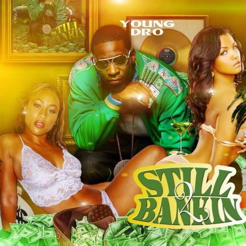
I'd say make "up" a little more prominent and noticeable on the first one.. the yellow kinda blends into the background.. and therefore the title appears to say "hold boys"... maybe thicker font for "up".. and white.. or a dark contrasting "something" behind it
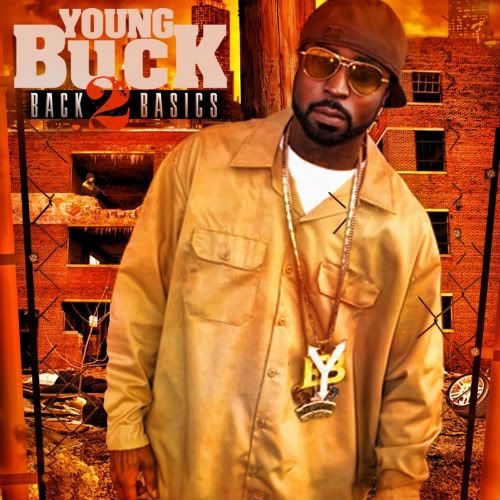
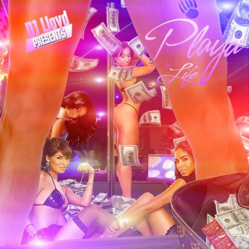
but yea contrast is everything, title lettering/logo standing out is of utmost importance, those color wheels are good examples that you get at art stores or you could find one online i'm sure... if the prominent color is in one extreme you wanna put the text in the opposite hue or white/dark gradient... if you scale down your cover to a fairly small thumbnail and the title isn't legible i'd say rework that...
clean work tho!


