Orange Blue Color Contrast in Movie Posters
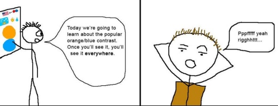
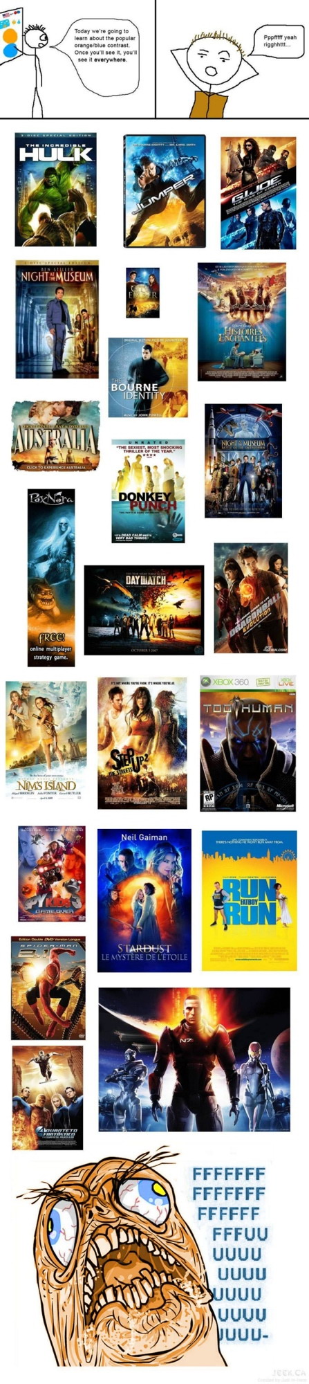
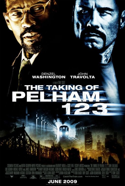
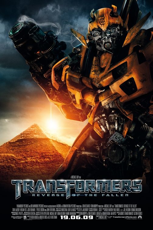
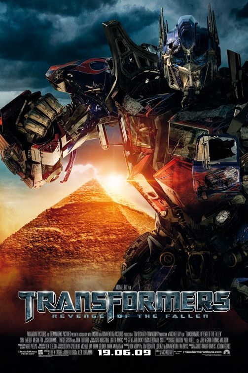
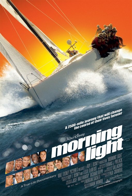
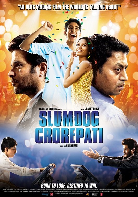
I’m sure you’re aware of Hollywood’s overuse of floating heads on movie posters… but have you noticed the excessive use of orange/blue contrast on theatrical one-sheets? David Chen happened to come across this comic illustrating the Blue/orange contrast, although I’m not sure where it originated or who created it. After the jump you will see a ton of examples of orange/blue contrast, however I must warn you — as the comic says, once you see it, you’ll notice it everywhere.
Yes, Of course….
Orange/blue just so happens to be the most common set of complementary colors because blue is “cool” and orange is “enthusiastic” and “energetic.”