New Website temp. crit plz
- Thread starter EniGmatik
- Start date
that image took forever to load and I have DSL I know once its a page it should load sooner
also what type of template is this flash, wordpress or basic html
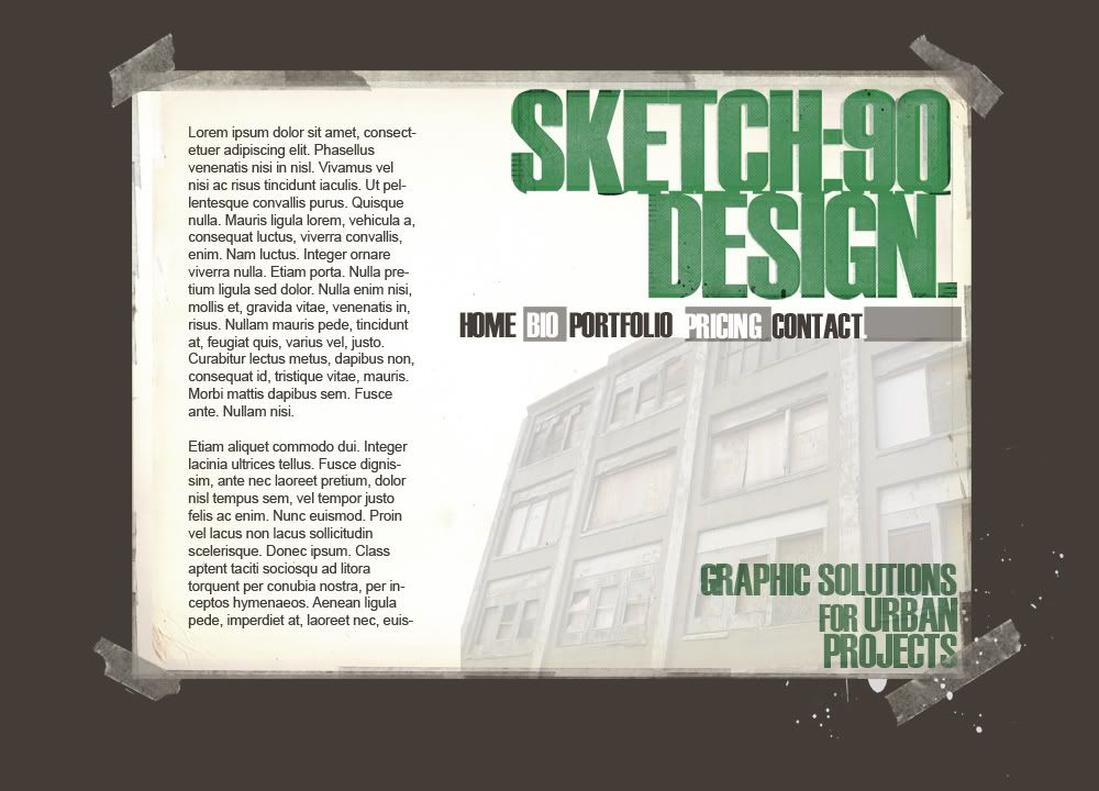
I don't think this layout will work well for a portfolio site, the design is cool don't get wrong, you ask for a critic and thats what I'm giving.
for me the text placement is off, my eyes leave the text right away and go to the background image of the building. I fell your important text should be over that image and you could used the left side bar to display some of your recent works. I also don't like how the left edge of the build is cut off
on the links I don't like how the P in pricing goes to the edge of that box, if you did that to play with the urban theme then maybe tilt/rotate the box a bit. Or make the B in Bio match that and have it go to the edge as well
things I do like is the taped up background you got going on, the color scheme is on point and that building
also what type of template is this flash, wordpress or basic html
I don't think this layout will work well for a portfolio site, the design is cool don't get wrong, you ask for a critic and thats what I'm giving.
for me the text placement is off, my eyes leave the text right away and go to the background image of the building. I fell your important text should be over that image and you could used the left side bar to display some of your recent works. I also don't like how the left edge of the build is cut off
on the links I don't like how the P in pricing goes to the edge of that box, if you did that to play with the urban theme then maybe tilt/rotate the box a bit. Or make the B in Bio match that and have it go to the edge as well
things I do like is the taped up background you got going on, the color scheme is on point and that building
The menu options need to be all the same color apart from the current page which can be a different color menu option. Right now I dont know what page I am viewing because the pattern of menu options doesn't tell me whether I am looking at the home page or the bio or portfolio or pricing ect...
I dont really like the sticky tape looks like a cheap effect.
The splatter in the bottom right looks out of context with the design.
The bottom left of the building is chopped off by the dummy content.
I can only see this working as a flash site.
I like the bottom left of the page where you have used a slight crease in the paper which looks cool.