NEW SHIRT DESIGN!!! LITTLE DIFFERENT STYLE.
- Thread starter )-HANGMAN-(
- Start date
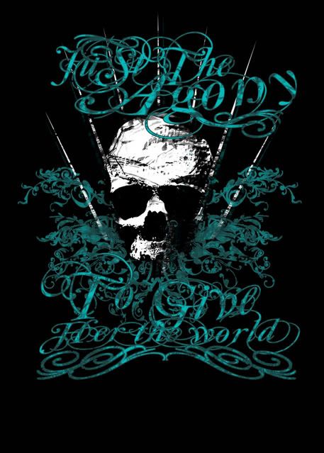
You need to accentuate the text more so it pops out, making it easier to read, white would be a good color to use as it would tie in with the skull and look more balanced at the same time. I'm not saying make the font white, I'm just saying add accent to the teal color by adding a highlight onto it, preferably a white color. The clarity of the text needs to be fixed though.
Looks dope.
Looks dope.
I'd also recommend leaving the style areas of the font teal, the curvy parts that come off the type and swirl around, and only accent the actual "letters" themselves, so it's not so distracting. Took me a minute to figure out what the fuck it said, I'm still lost at the top part ????? The Agony To Give Her The World?