New Flyer
- Thread starter JSavv
- Start date
did this in 2 hours doesnt justify shit, that only makes it seem like you didnt put enough effort into it and leads readers to believe that the quality aint up there even if they haven't seen the flyer yet...
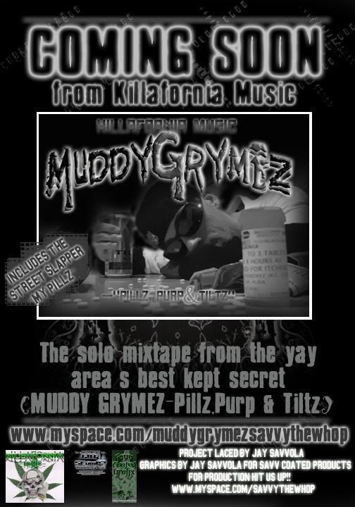
This aint that bad tho, i like some things and somethings I dont like, mostly the text being hard to read but if the customer likes it then who cares...
This aint that bad tho, i like some things and somethings I dont like, mostly the text being hard to read but if the customer likes it then who cares...
bruh, you really shouldnt put your work on here if you cant take criticism. I think that for the most part everyone that posted a comment gave you their constructive opinion. I personally think its too dull. I think its because the grey and black. Also, I would suggest taking the glow off on the white text on the bottom. Its already white, you dont really need the extra white glow, especially not on a black bg..just my 2 pennies.
what i dont get is why the 2 logos are green...just throws the whole thing off...
ive seen a lot of your work and i always like the set up of the photography...although the quality of the actual photo is low and then designs tend to be low quality as well...
i think you just need better quality (clearer higher resloution) pics and you be better off...
ive seen a lot of your work and i always like the set up of the photography...although the quality of the actual photo is low and then designs tend to be low quality as well...
i think you just need better quality (clearer higher resloution) pics and you be better off...