New D-Money Cover I Laced Up
- Thread starter JSavv
- Start date
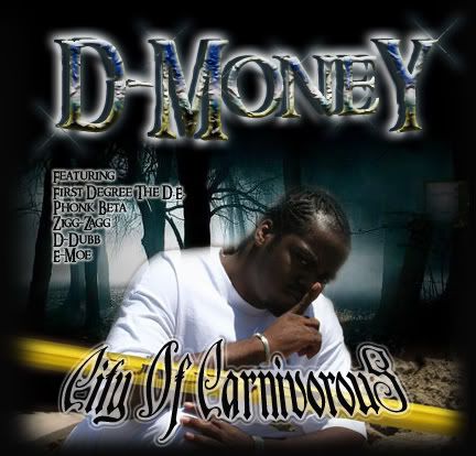
i saw when you posted it in bart. there's something about that cover that screams boring. the only text i like is the featuring text i don't like the dmoney text or the city of carnivorous text they are boring. it looks like his arm is moving or something at the top by his right shoulder because it's blurry.
it just takes time, anybody who is good at design started somewhere and i guarantee they were horrible when they started. u just gotta keep practicing, learn what works and what doesnt, don't try to do too much
the text needs work
overall it does look really old, like an old ass bay or sac cover
the cutout needs work, you can see thru his right shoulder
even having the feature names on the front hella big is some old bay shit
and like somebody said in the bart, is that yellow tape or a number 2 pencil?
the text needs work
overall it does look really old, like an old ass bay or sac cover
the cutout needs work, you can see thru his right shoulder
even having the feature names on the front hella big is some old bay shit
and like somebody said in the bart, is that yellow tape or a number 2 pencil?