GMG MUSIC GROUP- http://www.myspace.com/gmgmusicgroup
GMG GRAPHICS-http://www.myspace.com/gmggraphics
JAY JIZZLE- http://www.myspace.com/jayjizzlegmg

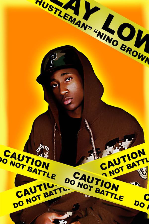
LAY LOW- http://www.myspace.com/laylowakahustelman
G.CARTER-http://www.myspace.com/moegreen707

DECE-http://www.myspace.com/dece1

GMG GRAPHICS-http://www.myspace.com/gmggraphics
JAY JIZZLE- http://www.myspace.com/jayjizzlegmg
LAY LOW- http://www.myspace.com/laylowakahustelman
G.CARTER-http://www.myspace.com/moegreen707
DECE-http://www.myspace.com/dece1