I started on this a couple of weeks ago and never got to finish it... I prolly never will so i'll post it now... Like i said earlier it aint finished... and its my first... hard as fuck to do!! Not for u guys tho... i seen some of y'all make logos easy....
You use Adobe Illustrator, n there are tutorials, but it takes time to learn, its similer to Photoshop, but its a lot harder, atleast in my point of view...
Try workin on Photoshop first, dont get carried away, you think its easy by the way you talk, once youve done a lot in Photoshop wit the pens n paths, then you can start with illustrator..im a beginner yself but learning day by day.
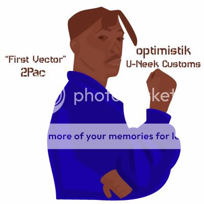
All the shadowing & highlighting is backwards. Your paths aren't too bad but ya' need to watch the color changes. I.g. The cheekbone accent around his eye should be lighter than the tone around it . . . the whites in the eyes should be lighter than the skin tone enclosing them, the lighter swoosh's in his hands should be darker as those areas represent the shadows in his hand . . . same with jacket highlights / shadows
No, you got the right idea, you were just applying darker colors to what was lighter / highlighted areas and visa versa. take a second look. Keep at it!