Game Cover...
- Thread starter Jaguar
- Start date
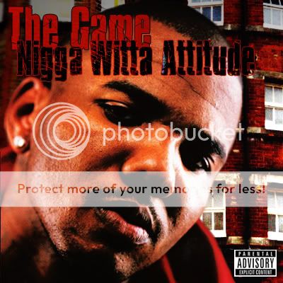
Well, I think that by havin your text red n black isn't good, since the covers color is mostly red, try makin the text have a color that stands out on red, first i'd change the text on te cover, then I would take "The Game" text and make the inside white or maybe some kind of light texture, then id take the text "Nigga Witta Attitude" and move it down n keep it black wit a red stroke, it would bring out the colors more...
I think it's perfect just as is! I like the color the richness, text and color is fine to me. I like the mug shot and the small focus area (forground face, and the side to rear to collar focus softening) makes it have more of a personal feel.
I can't commend him on his album name, hasn't that been used before, like 10 years ago by "N.W.A."?
I think you've accomplished what you aimed to do though, good cover.
I can't commend him on his album name, hasn't that been used before, like 10 years ago by "N.W.A."?
I think you've accomplished what you aimed to do though, good cover.
I'm partially in agreement with TheGraphixLab as far as the richness of the colour goes as well as the focus of the photo. I do think there is some work to be done with the typography however. Try a few different fonts for the album title and/or the artist name so that they are not the same or so similar to give ita boost of contrast. Solid design regardless.
Regards
Regards


