Boy Dirt cover!
- Thread starter lil_wattage
- Start date
lil_wattage said:
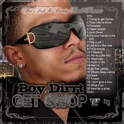
First of all, it's all over the place, it looks like you tried to incorporate a bunch of styles but failed at all of them.
You have 2 borders. Pick 1 and stick with it. The second border comes way too far in IMO.
The photo is just wrong in so many ways. It looks blurry, the cut is choppy, looks like you decapitated dude and slapped his face on the cover, it's positioned wrong, the glasses look photo-shopped, and honestly the expression on the face, it looks like you cut his mug out of a photo where he may have been laying in an open casket? Dude looks dead, dead expression.
The reflection of cash in the glasses looks bad.
There is no contrast in the cover, the background is pointless, you can't see anything.
Text is too basic, it doesn't even look good, you need to work on your font type choice.
Track listing looks very small, and awkward. The blurry glow you have behind it is tacky.
It's all just very tacky and looks amateur.
Colors are dull!
Keep practicing.