WHICH COVER IS BETTER?

  • Wanna Join? New users you can now register lightning fast using your Facebook or Twitter accounts.

WHICH COVER IS BETTER?


  • Total voters
    92

C-4

Sicc OG
Apr 25, 2002
8,022
1,135
113
46
#3
i like the first one better, but the Krypto font is not the business

don't like the pic on the 2nd one
 

Defy

Cannabis Connoisseur
Jan 23, 2006
24,139
16,658
0
46
Rich City
#11
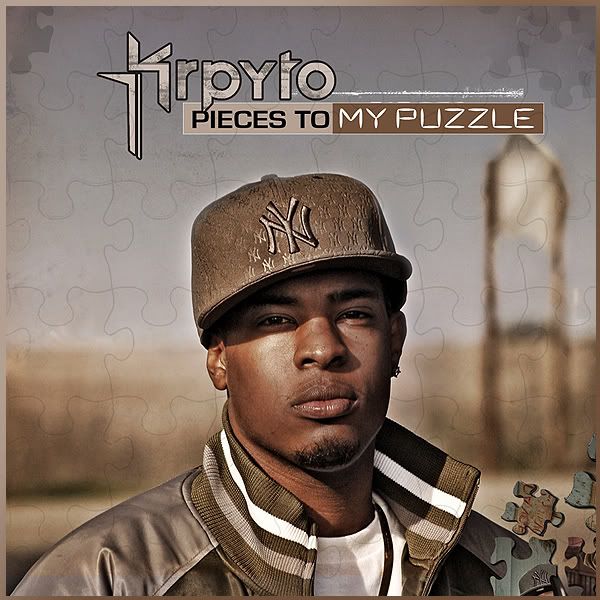
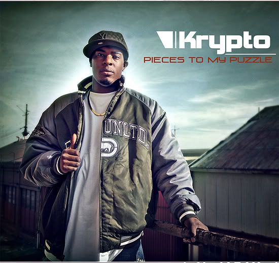
I like elements of both but I don't like either cover. I'd say use the puzzle element of the first one on the second one....although the thumbs up is kinda corny, but the colors are dope....I mean, the colors work well on the first one, but the text is just ass and all you see is face.


where's the option for "fuck NY, wear something bay related"?
 
Oct 18, 2006
137
0
0
56
#15
The first one is dope!

check out Tha Alkaholiks, A Plus, Starski, Rell Dert and more at Cafe du Nord in SF... Sat March 29th... cop advance tickets at City Player at the Serramonte Mall, or online at Ticketweb.com
 
May 14, 2002
460
0
0
38
#17
Dont like the close up of his face on the first one wouldnt really make me want to buy his album if i didnt know who he was. The second one is a lil bit better but honestly i really dont like any of them, however they are both good quality.
 
Nov 26, 2007
676
2
0
42
#19
Dont like the close up of his face on the first one wouldnt really make me want to buy his album if i didnt know who he was. The second one is a lil bit better but honestly i really dont like any of them, however they are both good quality.
I agree with this...with artists that aren't really recognizable by face, it always seems to work better if the name and design is the focal point.