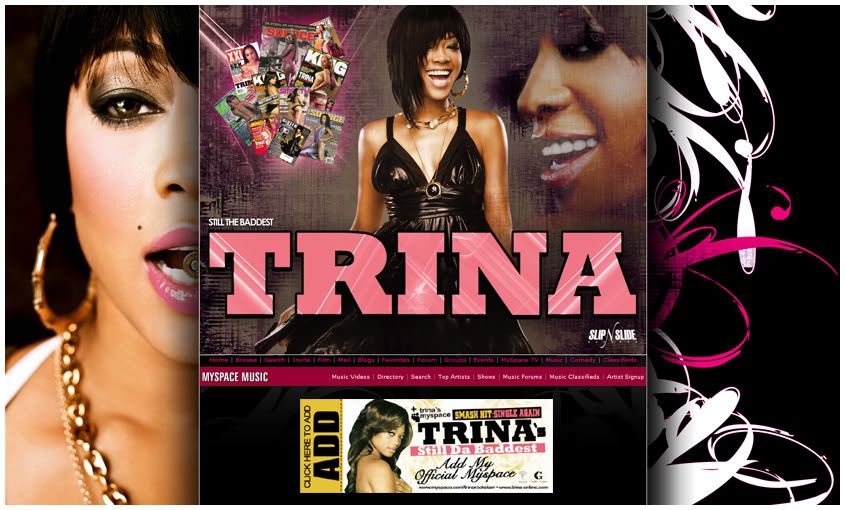
NEW MYSPACE FOR TRINA (BADDEST BITCH)
- Thread starter LadyTragik
- Start date
Its dope but I would like to see it with the "Click Here to Add" going more to each direction. I think it looks like just placed there right now cause its so small and just irreplaced. So I would put it from 1 side to anohter and just a lil space.
Also put that bar on the top (the thing we spoke about in the PM") )
)
Also put that bar on the top (the thing we spoke about in the PM
)
says photography and design by you?and how the fuck do you get this?looks good.
Its dope but I would like to see it with the "Click Here to Add" going more to each direction. I think it looks like just placed there right now cause its so small and just irreplaced. So I would put it from 1 side to anohter and just a lil space.
Also put that bar on the top (the thing we spoke about in the PM )
Also put that bar on the top (the thing we spoke about in the PM
)
hit me so we can reschedule the shoot