NEW FLYER FOR ME
- Thread starter J.COLOMBO
- Start date

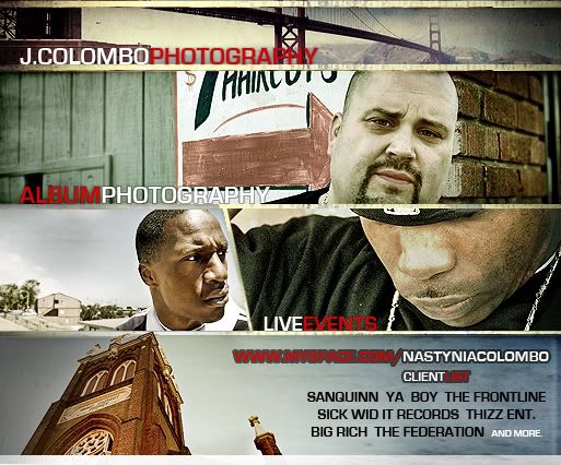
I like it except for the picture of the bald guy. all the other pictures are real dope and have great elements about them, but that one is just plain to me. I don't like the word photography (not the word, but the way its laid out over things) it does look better with the colors switched, but it still doesn't stand out. the H blends in with the bridge on the top pic and the graphy blends into the white sign. well, maybe not blends in, but they don't stand out. maybe it needs an outline or something.
I don't like this for a flyer to advertise your photography business....... especially for hiphop..... if I seen this printed it wouldn't say "HIPHOP/RAP/R&B PHOTOGRAPHY" and it lacks some color, i'm not trying to give you a negative vibe at all, I honestly would see this flyer somewhere and think "unprofessional" by the way the fonts/colors etc are setup... but if it works for you rock with it... the photo's are pretty clean
layout is sick and you picked good pictures..i also like what you did to the pics, it shows u got editing skills but u didnt make them look cheesy or hella photoshoped. but i dont like the fonts so much they look bad quality or sumtin..one of them is a preset font for sum old school word processing program i think. the jcolombo and photography dont look So bad but the clients at the bottom and the one with the grey stroke look poor.