***NEW FLYER IM WORKING ON GIVE FEED BACK***
- Thread starter JayGMG
- Start date
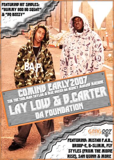
artist pics are blending in with the background and they should be the main focus...
text needs to be reworked like previously stated...trya different font for the info then the one you used for the main text.... the main text itself is kinda bland
and those corner things kinda suck....if you keep the info in the corn try adding an effect were it looks like they are burnt off
text needs to be reworked like previously stated...trya different font for the info then the one you used for the main text.... the main text itself is kinda bland
and those corner things kinda suck....if you keep the info in the corn try adding an effect were it looks like they are burnt off