J JayGMG Sicc OG Sep 11, 2006 #1 Jun 9, 2006 145 0 0 35 www.wubbieentertainment.com Sep 11, 2006 #1 J JayGMG Sep 11, 2006 SOME ARTWORK I BEEN WORKING ON ANY CHANGES OR IDEAS PLEASE GIVE FEED BACK... THANKS
3 3deanhg Sicc OG Sep 11, 2006 #2 May 10, 2002 2,099 5 0 nhg2002.cjb.net Sep 11, 2006 #2 3 3deanhg Sep 11, 2006 i dunno. im really not feelin it for some reason..... i looked at it again and i found the problem... i dont get it..... looks like a million things goin on
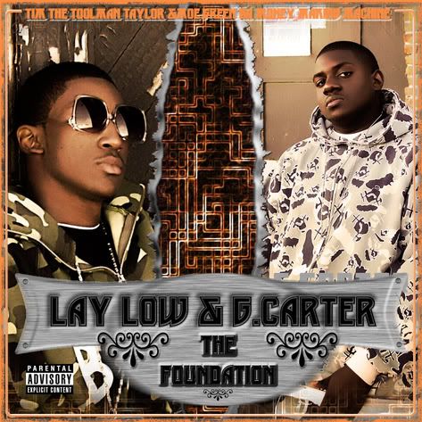
i dunno. im really not feelin it for some reason..... i looked at it again and i found the problem... i dont get it..... looks like a million things goin on
azryda420 Sicc OG Sep 11, 2006 #3 Jun 23, 2003 5,126 4 0 43 Sep 11, 2006 #3 azryda420 Sep 11, 2006 To me, the font is hard to read on top. And the cover has no realy concept. It looks nice though.
ZEKt1 Member Sep 11, 2006 #4 May 1, 2006 41 0 0 43 Sep 11, 2006 #4 ZEKt1 Sep 11, 2006 it looks cool fam
L likewhaa Sicc OG Sep 11, 2006 #5 Jan 13, 2006 315 0 0 37 www.myspace.com Sep 11, 2006 #5 L likewhaa Sep 11, 2006 :not to be quoted: the guy on the left looks real grand theft autoish..thats just my oppinion :not to be quoted:
:not to be quoted: the guy on the left looks real grand theft autoish..thats just my oppinion :not to be quoted:
Likwid Sicc OG Sep 11, 2006 #6 Apr 16, 2003 14,728 1,355 113 41 google.com Sep 11, 2006 #6 Likwid Sep 11, 2006 Those light peachy and orange colors you always use GOTTA GO. They make your work look dull even when you have good placement and stuff.
Those light peachy and orange colors you always use GOTTA GO. They make your work look dull even when you have good placement and stuff.
J JayGMG Sicc OG Sep 11, 2006 #7 Jun 9, 2006 145 0 0 35 www.wubbieentertainment.com Sep 11, 2006 #7 J JayGMG Sep 11, 2006 thats whats up thanks for bein real
Likwid Sicc OG Sep 11, 2006 #8 Apr 16, 2003 14,728 1,355 113 41 google.com Sep 11, 2006 #8 Likwid Sep 11, 2006 I noticed behind the brushed metal panel it looks like some text forgot to be deleted. I think it also says G. Carter in silver..
I noticed behind the brushed metal panel it looks like some text forgot to be deleted. I think it also says G. Carter in silver..
J JayGMG Sicc OG Sep 12, 2006 #9 Jun 9, 2006 145 0 0 35 www.wubbieentertainment.com Sep 12, 2006 #9 J JayGMG Sep 12, 2006 Likwid said: I noticed behind the brushed metal panel it looks like some text forgot to be deleted. I think it also says G. Carter in silver.. Click to expand... LOL THANKS IM SLIPPIN LOL
Likwid said: I noticed behind the brushed metal panel it looks like some text forgot to be deleted. I think it also says G. Carter in silver.. Click to expand... LOL THANKS IM SLIPPIN LOL
Likwid Sicc OG Sep 12, 2006 #10 Apr 16, 2003 14,728 1,355 113 41 google.com Sep 12, 2006 #10 Likwid Sep 12, 2006 Sometimes it just takes another pair of eyes. It's all good.
J JayGMG Sicc OG Sep 12, 2006 #11 Jun 9, 2006 145 0 0 35 www.wubbieentertainment.com Sep 12, 2006 #11 J JayGMG Sep 12, 2006 THANKS LOL BRUH BRUH
eMDe Sicc OG Sep 13, 2006 #12 Apr 25, 2002 1,942 173 0 Sep 13, 2006 #12 eMDe Sep 13, 2006 to be totally honest.. sometimes a fresh start is the best advice. Try a differenct approach, and think of a concept first.
to be totally honest.. sometimes a fresh start is the best advice. Try a differenct approach, and think of a concept first.